table of contents
Vue.js (1)은 스프링부트 (3) 마지막 부분에 같이 들어갔음. 그날 같이 배운 거라 같이 넣었음.
HTML 기본기
사실 이게 모르는 내용이 아니라서 그다지 의욕적이지는 않긴 한데요 그래도 써놓으면 쓸 데가 있는 것들은 적었음
- 블록 레벨 요소: 무조건 한 층 차지함
p는 한 줄에 하나만 들어가지만
- 인라인 레벨 요소: 한 줄에 여러 개 들어갈 수 있음
span은 한 줄에 여러 개도 들어감
form은 입력 폼 요소fieldset은 폼 안에서 입력 요소를 그룹화하는 것label: 이 입력칸이 뭘 의미하느냐for="{id}":label인자로 넣으면 라벨 텍스트를 클릭했을 때 입력칸으로 포커스가 가게 됨
button: 버튼.type="submit": 입력된 폼 내용을 어딘가에 보냄type="reset": 입력된 폼 내용을 싹 지워버림
CSS
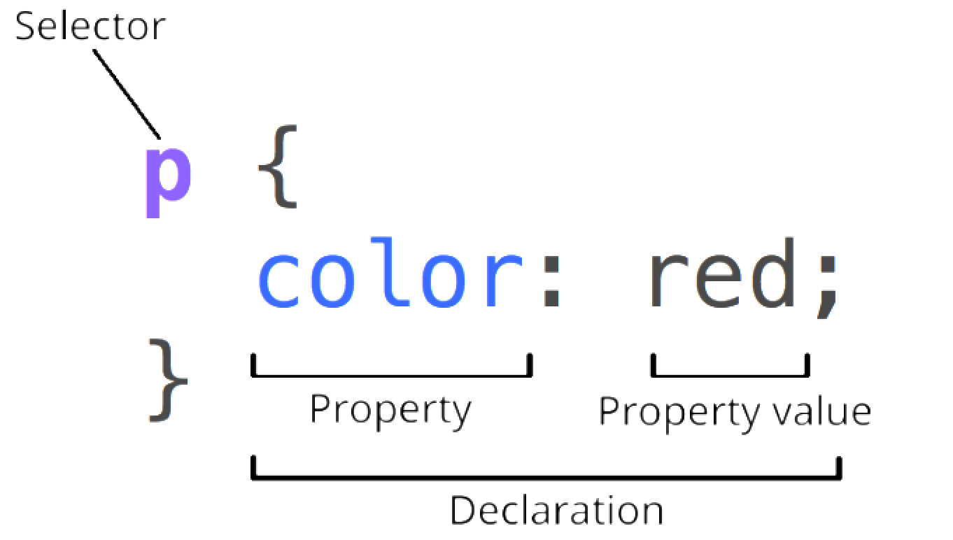
- HTML은 못생겼어요. 안못생기려면 CSS를 써야돼.
CSS는 아래의 구조로 구성되고, 나중에 지정되는 속성이 앞서 지정된 것을 덮어쓰기한다.
![260401-HAE-1-vuejs-2.png]()
display: flex;: 이 나와바리 안에서는 모두 인라인이 되어라flex-direction: 어느 방향으로 인라인 할건지. [row,column,row-reverse] 중 선택flex-wrap: 줄바꿈 어떻게 할래 [wrap,nowrap,wrap-reverse] 중 선택justify-content: 정렬 어떻게 할래 [center,flex-start,flex-end,space-between,space-around,space-evenly]
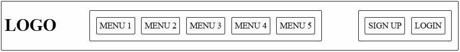
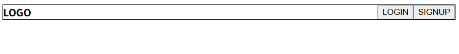
문제: 로고, 메뉴, 회원가입/로그인이 존재하는 헤더를 만들어라 (요소 구분 잘보이라고 테두리 넣었음)
![image.png]()
1
2
3
4
5
6
7
8
9
10
11
12
13
14
15
16
div {
    align-items: center;
    padding: 5px;
    /* 내부 여백 */
    margin: 5px;
    /* 여백 */
}

.navbar,
.menu-group,
.auth-group {
    display: flex;
    /* 가로 배치 */
    justify-content: space-between;
    /* 양쪽 여백 동일 */
}
1
2
3
4
5
6
7
8
9
10
11
12
13
14
<div class="navbar">
    <h1>LOGO</h1>
    <div class="menu-group">
        <div>MENU 1</div>
        <div>MENU 2</div>
        <div>MENU 3</div>
        <div>MENU 4</div>
        <div>MENU 5</div>
    </div>
    <div class="auth-group">
        <div>SIGN UP</div>
        <div>LOGIN</div>
    </div>
</div>
약간 꾸미기
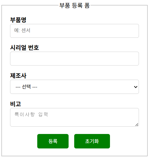
보통 알고 있는 그 폼의 형태를 html과 css로 만들자
1
2
3
4
5
6
7
8
9
10
11
12
13
14
15
16
17
18
19
20
21
22
23
24
25
26
27
28
29
30
31
32
33
34
35
36
37
38
39
40
41
42
43
<!DOCTYPE html>
<html lang="ko">

<head>
    <meta charset="UTF-8">
    <meta name="viewport" content="width=device-width, initial-scale=1.0">
    <link rel="stylesheet" href="beautify-form.css">
    <title>Form example</title>
</head>

<body>
    <form class="form-container">
        <fieldset>
            <legend>부품 등록 폼</legend>
            <div>
                <label for="part-name">부품명</label>
                <input type="text" id="part-name" name="partName" placeholder="예: 센서">
            </div>
            <div>
                <label for="serial-number">시리얼 번호</label>
                <input type="text" id="serial-number" name="serialNumber">
            </div>
            <div>
                <label for="oem">제조사</label>
                <select id="oem" name="oem">
                    <option value="">--- 선택 ---</option>
                    <option value="hyundai">현대오토에버</option>
                    <option value="etc">기타</option>
                </select>
            </div>
            <div>
                <label for="note">비고</label>
                <textarea id="note" name="note" placeholder="특이사항 입력"></textarea>
            </div>
            <div class="btns">
                <button type="submit">등록</button>
                <button type="reset">초기화</button>
            </div>
        </fieldset>
    </form>
</body>

</html>
1
2
3
4
5
6
7
8
9
10
11
12
13
14
15
16
17
18
19
20
21
22
23
24
25
26
27
28
29
30
31
32
33
34
35
36
37
38
39
40
41
42
43
44
45
46
47
48
49
50
51
52
53
54
55
56
57
58
59
60
61
62
63
.form-container {
    display: flex; /* 내부 요소를 인라인으로 배치 */
    flex-direction: column; /* 내부 요소를 세로로 배치 */
    max-width: 400px; /* 최대 너비 제한 */
}

h1 {
    text-align: center; /* 글자 중앙 정렬 */
}

label {
    font-weight: bold; /* 글자 두껍게 */
}

.btns {
    display: flex; /* 내부 요소를 인라인으로 배치 */
    justify-content: center; /* 내부 요소를 가운데 정렬 */
    gap: 10px; /* 요소 간 여백 */
}

button {
    background: green; /* 배경색 */
    color: white; /* 글자색 */
    cursor: pointer; /* 마우스 커서를 올리면 포인터 모양으로 변경 */
    border: none; /* 테두리 없음 */
    border-radius: 5px; /* 둥근 테두리 */
    padding: 10px 30px; /* 내부 여백 */
    margin-right: 5px; /* 외부 오른쪽 여백 */
}

legend {
    text-align: center; /* 글자 중앙 정렬 */
}

input {
    width: 100%; /* 너비 100% */
    padding: 10px; /* 내부 여백 */
    border: 1px solid #ccc; /* 테두리 */
    border-radius: 5px; /* 둥근 테두리 */
    box-sizing: border-box; /* input box 사이즈를 테두리에 맞춤 */
}

select {
    width: 100%; /* 너비 100% */
    padding: 10px; /* 내부 여백 */
    border: 1px solid #ccc; /* 테두리 */
    border-radius: 5px; /* 둥근 테두리 */
    box-sizing: border-box; /* select box 사이즈를 테두리에 맞춤 */
}

textarea {
    width: 100%; /* 너비 100% */
    padding: 10px; /* 내부 여백 */
    border: 1px solid #ccc; /* 테두리 */
    border-radius: 5px; /* 둥근 테두리 */
    box-sizing: border-box; /* textarea 사이즈를 테두리에 맞춤 */
}

div {
    margin: 5px; /* 외부 여백 */
    padding: 5px; /* 내부 여백 */
    box-sizing: border-box; /* div 사이즈를 테두리에 맞춤 */
}
반응형 웹 맛보기
화면이 작을 때는 로그인 버튼 대신 햄버거 버튼이 보이고, 화면이 커지면 햄버거 없이 로그인 버튼이 보이게 만들기
요점은 @media 태그로 화면 크기에 따른 동적 속성을 지정했다는 점

1
2
3
4
5
6
7
8
9
10
11
12
13
14
15
16
17
18
19
20
21
22
23
24
25
26
27
<!DOCTYPE html>
<html lang="en">
<head>
    <meta charset="UTF-8">
    <meta name="viewport" content="width=device-width, initial-scale=1.0">
    <link rel="stylesheet" href="interactive-01.css">
    <title>Interactive 01</title>
</head>
<body>
    <div class="container">
        <nav class="nav">
            <span>LOGO</span>

            <div class="auths">
                <button>LOGIN</button>
                <button>SIGNUP</button>
            </div>

            <div class="hamburger">
                <span></span>
                <span></span>
                <span></span>
            </div>
        </nav>
    </div>
</body>
</html>
1
2
3
4
5
6
7
8
9
10
11
12
13
14
15
16
17
18
19
20
21
22
23
24
25
26
27
28
29
30
31
32
33
34
35
36
37
38
39
40
41
.container {
    border: 1px solid black; /* 테두리 검은색 */
}

.nav {
    display: flex; /* 플렉스 컨테이너로 설정 */
    justify-content: space-between; /* 자식 요소들을 양 끝으로 배치 */
}

span {
    font-weight: bold; /* 글자 굵게 */
}

.hamburger {
    display: flex; /* 플렉스 컨테이너로 설정 */
    flex-direction: column; /* 세로 방향으로 배치 */
    width: 32px; /* 너비 32px */
    height: 32px; /* 높이 32px */
    cursor: pointer; /* 마우스 커서가 손 모양으로 변경 */
    justify-content: center; /* 자식 요소들을 세로 방향으로 중앙 정렬 */
}

.hamburger span {
    display: block; /* 블록 요소로 설정 */
    height: 4px; /* 높이 4px */
    background: #222; /* 배경색 검은색 */
    margin: 3px 0; /* 위아래 여백 3px, 좌우 여백 0 */
}

.auths {
    display: none; /* 기본적으로 숨김 처리 */
}

@media (min-width: 600px) { /* 화면 너비가 600px 이상일 때 적용 */
    .auths {
        display: flex; /* 플렉스 컨테이너로 설정 */
    }
    .hamburger {
        display: none; /* 화면 너비가 600px 이상일 때 햄버거 메뉴 숨김 */
    }
}
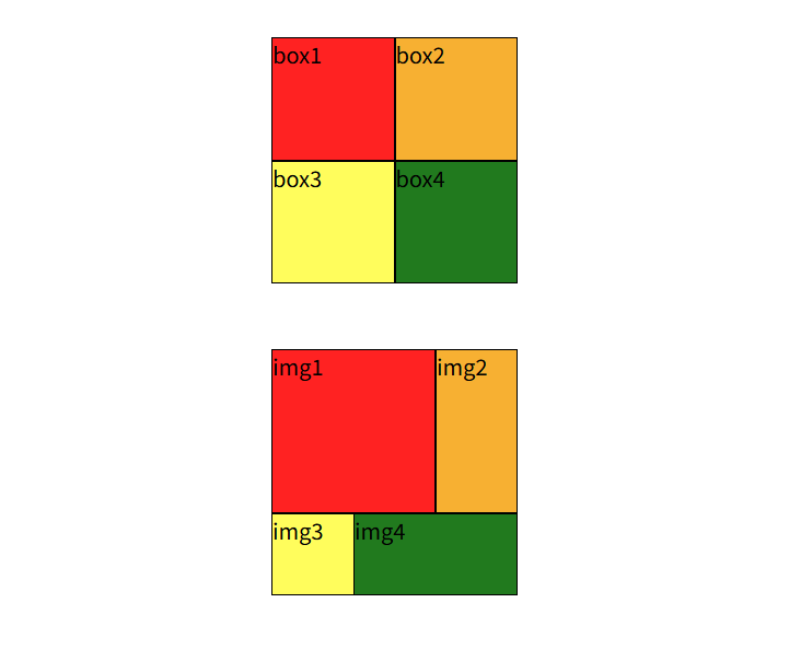
굳이 번거롭게 CSS로 그림을 그리세요
난 약간 이걸 이렇게 하는 게 맞아? 싶은 느낌이야 이렇게까지 번거롭게 저걸 그려야만 한다고? 다른 방법이 없다고?
1
2
3
4
5
6
7
8
9
10
11
12
13
14
15
16
17
18
19
20
21
22
23
24
25
26
<!DOCTYPE html>
<html lang="en">
<head>
    <meta charset="UTF-8">
    <meta name="viewport" content="width=device-width, initial-scale=1.0">
    <link rel="stylesheet" href="draw.css">
    <title>Interactive 02</title>
</head>
<body>
    <div class="container">
        <div class="grid-2x2">
            <div class="box1">box1</div>
            <div class="box2">box2</div>
            <div class="box3">box3</div>
            <div class="box4">box4</div>
        </div>

        <div class="unbalanced-grid-2x2">
            <div class="img1">img1</div>
            <div class="img2">img2</div>
            <div class="img3">img3</div>
            <div class="img4">img4</div>
        </div>
    </div>
</body>
</html>
1
2
3
4
5
6
7
8
9
10
11
12
13
14
15
16
17
18
19
20
21
22
23
24
25
26
27
28
29
30
31
32
33
34
35
36
37
38
39
40
41
42
43
44
45
46
47
48
49
50
51
52
53
54
55
56
57
58
59
60
61
62
63
64
65
66
67
.container {
    display: flex; /* 플렉스 컨테이너로 설정 */
    flex-direction: column; /* 세로 방향으로 배치 */
    align-items: center; /* 자식 요소들을 가로 방향으로 중앙 정렬 */
    margin-top: 32px; /* 위쪽 여백 32px */
}

.grid-2x2 {
    display: grid; /* 그리드 컨테이너로 설정 */
    grid-template-columns: 90px 90px; /* 열 너비 90px 90px */
    grid-template-rows: 90px 90px; /* 행 높이 90px 90px */
    gap: 0; /* 그리드 아이템 사이의 간격 0 */
    margin-bottom: 48px; /* 아래쪽 여백 48px */
}

.unbalanced-grid-2x2 {
    display: grid; /* 그리드 컨테이너로 설정 */
    grid-template-columns: 1fr 1fr 1fr; /* 열 너비 1fr 1fr 1fr */
    grid-template-rows: 1fr 1fr 1fr; /* 행 높이 1fr 1fr 1fr */
    width: 180px; /* 너비 180px */
    height: 180px; /* 높이 180px */
    gap: 0; /* 그리드 아이템 사이의 간격 0 */
}

.grid-2x2 div {
    border: 1px solid black; /* 테두리 검은색 */
}

.unbalanced-grid-2x2 div {
    border: 1px solid black; /* 테두리 검은색 */
}

.box1, .img1 {
    background: #f22;
}

.box2, .img2 {
    background: #f7b032;
}

.box3, .img3 {
    background: #fffd5c;
}

.box4, .img4 {
    background: #217a1e;
}

.img1 {
    grid-column: 1 / 3; /* 1열부터 3열까지 차지 */
    grid-row: 1 / 3; /* 1행부터 3행까지 차지 */
}

.img2 {
    grid-column: 3 / 4; /* 3열부터 4열까지 차지 */
    grid-row: 1 / 3; /* 1행부터 3행까지 차지 */
}

.img3 {
    grid-column: 1 / 3; /* 1열부터 3열까지 차지 */
    grid-row: 3 / 4; /* 3행부터 4행까지 차지 */
}

.img4 {
    grid-column: 2 / 4; /* 2열부터 4열까지 차지 */
    grid-row: 4 / 3; /* 4행부터 3행까지 차지 */
}
아무리 그래도 마지막 그림은 좀 그래서 Cursor한테 뭐가 문제인지 설명해달라 했음
- 비효율의 이름
DRY 위반
같은 선언이 여러 선택자에 반복됩니다. 예를 들어
.grid-2x2 div와.unbalanced-grid-2x2 div의 테두리 규칙이 동일합니다.표현용/위치용 클래스 이름
box1~box4,img1~img4처럼 “역할”보다 “이 칸이 몇 번째인지”에 가깝게 붙인 이름은, 의미(semantic)가 약한 클래스 또는 프레젠테이션에 가까운 네이밍이라고 합니다.요소당 전용 클래스 (1:1 매핑)
HTML에서 각
div에 서로 다른 클래스 하나만 쓰는 패턴은, 클래스 문법을 쓰지만 선택자는 사실상 요소 하나만 가리키는 것과 비슷합니다. 이런 건 “클래스를 ID처럼 쓰는 패턴” 또는 “인스턴스 전용 클래스”라고 표현하기도 합니다.
- 이 파일에서 구체적으로 비효율적인 점
반복
그리드 자식
div의 테두리가 두 그리드에 각각 한 번씩 복제되어 있습니다. 구조만 다르고 스타일 의도가 같다면 한 곳으로 모을 수 있습니다.확장과 유지보수
칸이 늘어나면
box5,img5처럼 선택자와 HTML 클래스가 계속 늘어납니다. “패턴”이 아니라 “목록 나열”에 가깝습니다.색과 배치의 결합 방식
배경색은
.box1, .img1처럼 묶었지만, 그리드 영역(grid-column/grid-row)은img1~img4에만 있어 두 그리드가 서로 다른 규칙 세트를 가집니다. 의도는 맞을 수 있으나, “공통 셀 스타일”과 “이 레이아웃에서의 위치”가 파일 안에서 한눈에 분리되어 있지 않습니다.이름과 내용의 불일치
HTML 텍스트는
img1등이지만 실제로는 이미지가 아니라 색칠된div입니다. 나중에 읽는 사람에게 혼동을 줄 수 있습니다.
더 나은 방향을 한 줄로 말하면
같은 규칙은 한 선택자(또는 공통 클래스)로 묶고, 칸의 색·위치는
nth-child,grid-template-areas, CSS 변수(--cell-color) 등으로 “규칙”으로 표현하면 반복과 요소 전용 클래스 의존을 줄일 수 있습니다.참고: 64행 근처
grid-row: 4 / 3는 일반적인 그리드 라인 순서와 맞지 않아 의도한 배치가 안 나오거나 브라우저 처리가 애매해질 수 있는 값입니다. 레이아웃이 이상하면 이 부분을 따로 점검하는 것이 좋습니다.
cursor가 코드를 수리해줬다
1
2
3
4
5
6
7
8
9
10
11
12
13
14
15
16
17
18
19
20
21
22
23
24
25
26
27
28
29
30
31
32
33
34
35
36
37
38
39
40
41
42
43
44
45
46
47
48
49
50
51
52
53
54
55
56
57
58
59
60
61
62
63
64
65
66
67
68
69
70
71
72
73
74
75
76
77
78
79
80
:root {
    --draw-grid-cell-size: 90px;
    --draw-mosaic-size: 180px;
    --draw-stack-gap: 48px;
    --draw-page-top-margin: 32px;
    --draw-cell-border: 1px solid black;
    --draw-color-1: #f22;
    --draw-color-2: #f7b032;
    --draw-color-3: #fffd5c;
    --draw-color-4: #217a1e;
}

.container {
    display: flex;
    flex-direction: column;
    align-items: center;
    margin-top: var(--draw-page-top-margin);
}

.grid-2x2 {
    display: grid;
    grid-template-columns: var(--draw-grid-cell-size) var(--draw-grid-cell-size);
    grid-template-rows: var(--draw-grid-cell-size) var(--draw-grid-cell-size);
    gap: 0;
    margin-bottom: var(--draw-stack-gap);
}

.unbalanced-grid-2x2 {
    display: grid;
    grid-template-columns: 1fr 1fr 1fr;
    grid-template-rows: 1fr 1fr 1fr;
    width: var(--draw-mosaic-size);
    height: var(--draw-mosaic-size);
    gap: 0;
}

.grid-2x2 > div,
.unbalanced-grid-2x2 > div {
    border: var(--draw-cell-border);
}

.grid-2x2 > :nth-child(1),
.unbalanced-grid-2x2 > :nth-child(1) {
    background: var(--draw-color-1);
}

.grid-2x2 > :nth-child(2),
.unbalanced-grid-2x2 > :nth-child(2) {
    background: var(--draw-color-2);
}

.grid-2x2 > :nth-child(3),
.unbalanced-grid-2x2 > :nth-child(3) {
    background: var(--draw-color-3);
}

.grid-2x2 > :nth-child(4),
.unbalanced-grid-2x2 > :nth-child(4) {
    background: var(--draw-color-4);
}

.unbalanced-grid-2x2 > :nth-child(1) {
    grid-column: 1 / 3;
    grid-row: 1 / 3;
}

.unbalanced-grid-2x2 > :nth-child(2) {
    grid-column: 3 / 4;
    grid-row: 1 / 3;
}

.unbalanced-grid-2x2 > :nth-child(3) {
    grid-column: 1 / 3;
    grid-row: 3 / 4;
}

.unbalanced-grid-2x2 > :nth-child(4) {
    grid-column: 2 / 4;
    grid-row: 4 / 3;
}
리팩터링 요약
:root변수칸 크기, 180px 모자이크, 여백, 테두리, 네 가지 배경색을 이름 붙여 두었습니다. 숫자를 바꿀 때 한곳만 고치면 됩니다.
테두리 한 규칙
.grid-2x2 > div와.unbalanced-grid-2x2 > div를 한 선택자로 합쳤습니다.배경색
box1~box4,img1~img4대신 자식 순서인:nth-child(1)~(4)로 같은 색을 줍니다.draw.html구조가 그대로면 화면은 이전과 같고, 클래스 이름은 HTML에만 남고 스타일에서는 쓰지 않습니다.아래 그리드 배치
img1~img4전용 선택자 대신.unbalanced-grid-2x2 > :nth-child(n)에만grid-column/grid-row를 둬서, 원본과 동일한 선 배치를 유지했습니다. 네 번째 줄의grid-row: 4 / 3도 원본 그대로 두었습니다.