
table of contents
요약
- Seaborn 기본 개념·통계 시각화
- 스타일·팔레트 설정 :
sns.set_style('whitegrid'),sns.set_palette('gist_ncar' / 'Set2') - 폰트·마이너스 설정 :
plt.rcParams['font.family'] = "D2Coding",axes.unicode_minus = False - 데이터 경로·이미지 저장 경로 :
data_route,data_list,img_save = '../img/260212/'
- 스타일·팔레트 설정 :
- 박스/박스엔 플롯 (불량률 분포)
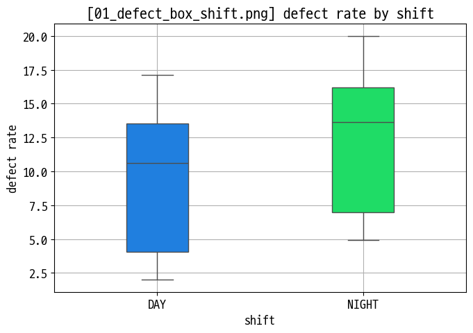
- 교대조별 불량률 박스플롯 :
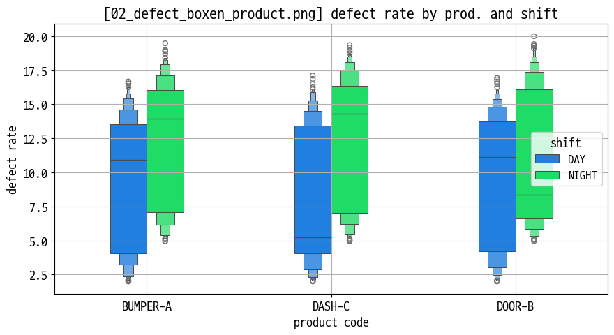
sns.boxplot(x='shift', y='defect_rate', ...)(01_defect_box_shift.png) - 제품별 불량률 박스엔(boxen) 플롯 : 긴 꼬리·극단값이 많은 분포 시각화 (
02_defect_boxen_product.png)
- 교대조별 불량률 박스플롯 :
- 바이올린 플롯 (분포 모양 비교)
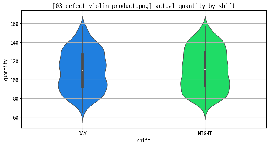
- 제품별 불량률 바이올린 플롯 : 중앙값·분산·꼬리 모양을 한 번에 표현 (
03_defect_violin_product.png)
- 제품별 불량률 바이올린 플롯 : 중앙값·분산·꼬리 모양을 한 번에 표현 (
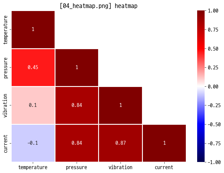
- 히트맵 (상관관계 매트릭스)
- 센서·생산 지표 간 상관관계 :
corr()+sns.heatmap(..., annot=True)(04_heatmap.png) - 색상 스케일·주석(숫자)로 강한 양/음의 상관관계 파악
- 센서·생산 지표 간 상관관계 :
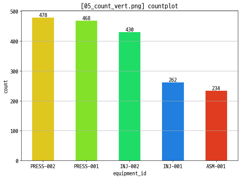
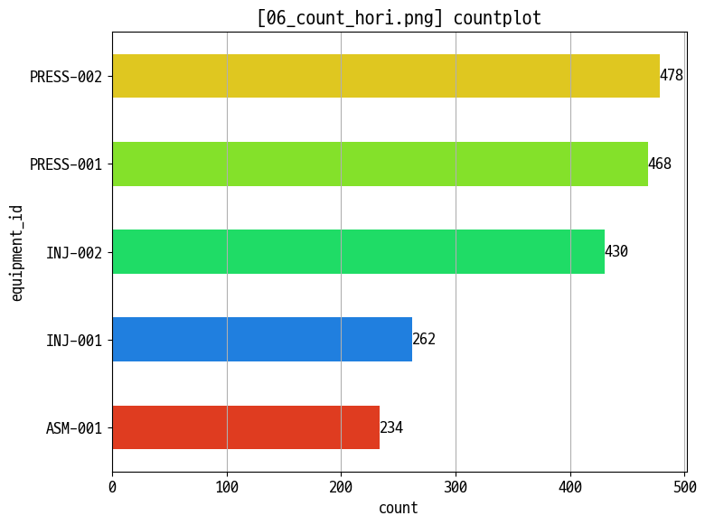
- 카운트 플롯 (범주형 빈도)
- 교대조·설비·제품별 생산 건수 :
sns.countplot(x=..., hue=...)세로/가로 버전 (05_count_vert.png,06_count_hori.png) - 범례·정렬·회전으로 카테고리 비교 가독성 개선
- 교대조·설비·제품별 생산 건수 :
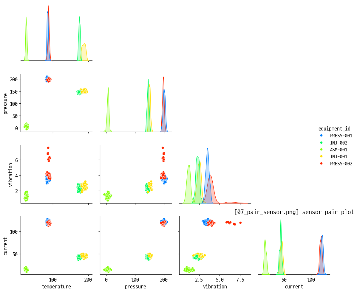
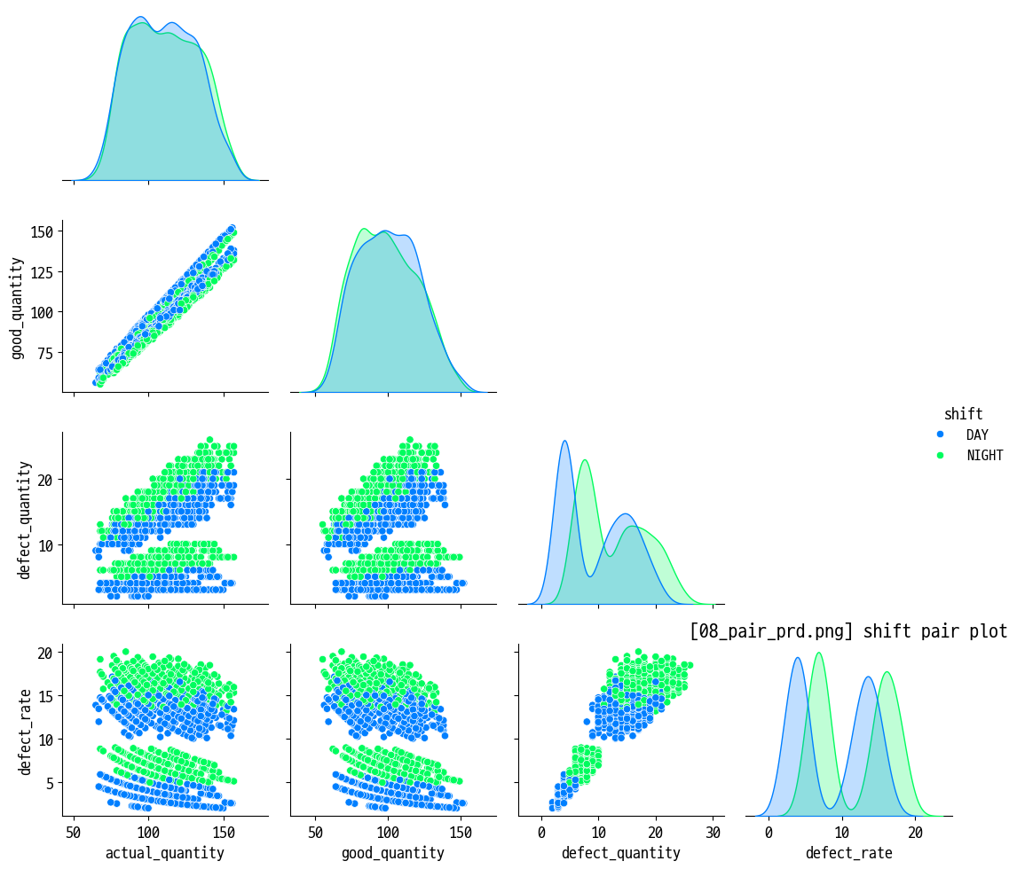
- 페어 플롯 (다변량 관계)
- 센서 데이터 페어플롯 : 온도·압력·진동·전류·전압·rpm 간 산점도/히스토그램 (
07_pair_sensor.png) - 생산 데이터 페어플롯 : 생산량·불량률·cycle time 등 지표 간 관계 확인 (
08_pair_prd.png)
- 센서 데이터 페어플롯 : 온도·압력·진동·전류·전압·rpm 간 산점도/히스토그램 (
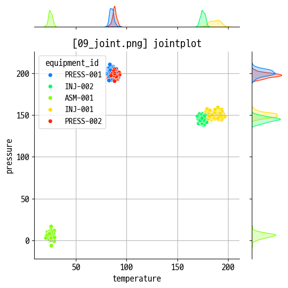
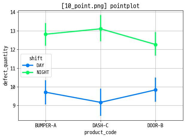
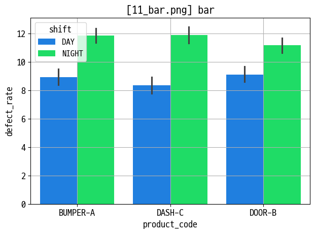
- Joint / Point / Bar / Strip / Swarm 플롯
- Jointplot : 연속형 변수 2개(예: 생산량 vs 불량률) 결합 분포 (
09_joint.png) - Pointplot : 카테고리별 평균 추세 + 신뢰구간 (
10_point.png) - Barplot : 그룹별 평균/합계 비교 (
11_bar.png) - Stripplot·Swarmplot : 카테고리별 개별 점 분포 시각화, 겹침 해소 (
12_strip.png,13_swarm.png)
- Jointplot : 연속형 변수 2개(예: 생산량 vs 불량률) 결합 분포 (
project1_oee_practice.ipynb- 프로젝트 1: 생산관리 - OEE & 생산 효율 분석
- 프로젝트 배경·목표 : 3개 라인·12대 설비·6종 제품의 OEE 분석, Six Big Losses 및 3월 개선 효과 검증
- 데이터 구성 : 설비 마스터, 제품 마스터, 생산실적 로그, 비가동 로그(
p1_equipment.csv,p1_product.csv,p1_production_log.csv,p1_downtime_log.csv)
- Part 0. 환경 설정 및 데이터 로드
data_route = '../강의자료/smart-practice/data/project1/'에서 4개 CSV 로드, 날짜·시간 컬럼 변환
- Part 1. 데이터 탐색 및 전처리
- 결측치·이상치 탐색, 기본 통계·분포 확인, 분석에 필요한 파생 컬럼 생성(예: 불량률, 가동시간 등)
- Part 2. OEE 계산 및 설비·라인 분석
- 가동률·성능률·양품률 계산, 설비·라인·기간별 OEE 집계 및 상위/하위 설비 비교
- Part 3. Six Big Losses 및 개선 효과 분석
- 비가동 유형별 손실 시간 집계, 3월 전/후 OEE 및 로스 지표 비교로 개선 효과 검증
- Part 4. 경영진 보고용 시각화·대시보드
- 라인·설비별 OEE 트렌드, 로스 구성 비율, 상위 문제 설비 Top-N 등을 시각화해 한 눈에 볼 수 있는 대시보드 구성
- 프로젝트 1: 생산관리 - OEE & 생산 효율 분석
- Seaborn·고급 시각화 인사이트 (해석·활용 관점)
- 핵심 질문 : “어떤 제품·설비·교대가 불량률 분포가 특히 넓거나 꼬리가 긴가?”, “어떤 지표 조합에서 강한 상관·패턴이 나타나는가?”, “라인·설비·기간별 OEE와 로스는 어디에 집중되어 있는가?”
- Seaborn 통계 차트 : 박스·바이올린·히트맵·페어플롯·Strip/Swarm 조합을 통해 분포·상관·이상치를 한 번에 파악할 수 있어, 예지보전·품질 예측 모델 설계 전 탐색 분석(EDA)에 특히 유용함.
- Subplot·이중 축·시계열 시각화 : 한 Figure 안에서 여러 지표를 동시에 보여 주면, 생산량·불량률·사이클타임·가동률 간 Trade-off와 트렌드를 직관적으로 비교할 수 있음.
- 프로젝트형 분석(OEE) : 단일 차트 연습을 넘어서, 데이터 품질 검사 → OEE 계산 → Six Big Losses → 전/후 비교 → 대시보드까지 한 흐름으로 수행함으로써, 실제 현업 보고서에 가까운 분석 스토리를 구성하는 연습이 된다.
오늘은 seaborn임
예고: 박스 플롯, 바이올린 플롯, 히트맵, 카운트 플롯, 페어 플롯
기본 세팅
1
2
3
4
5
6
7
8
9
10
11
12
13
14
15
16
17
18
19
20
21
22
23
24
25
import matplotlib.pyplot as plt
import seaborn as sns

sns.set_palette('gist_ncar')

plt.rcParams['font.family'] = "D2Coding"
plt.rcParams['axes.unicode_minus'] = False

plt.rcParams['font.size'] = 13  # 기본 폰트 크기
plt.rcParams['axes.labelsize'] = 13  # x,y축 label 폰트 크기
plt.rcParams['xtick.labelsize'] = 13  # x축 눈금 폰트 크기
plt.rcParams['ytick.labelsize'] = 13  # y축 눈금 폰트 크기
plt.rcParams['legend.fontsize'] = 12  # 범례 폰트 크기
plt.rcParams['figure.titlesize'] = 15  # figure title 폰트 크기

import os
import numpy as np
import pandas as pd

data_route = '../강의자료/smart-practice/data'
data_list = os.listdir(data_route)
data_list = [os.path.join(data_route, data_list[i]) for i in range(len(data_list))]
img_save = '../img/260212/'

os.path.exists(data_route), len(data_list), data_list[0]
1
2
3
4
5
6
data_prd = pd.read_csv(data_list[4], parse_dates=['production_date'])
data_sen = pd.read_csv(data_list[7], parse_dates=['measurement_time'])

data_prd['defect_rate'] = (data_prd['defect_quantity'] / data_prd['actual_quantity'] * 100).round(2)

data_prd.columns, data_sen.columns
박스/바이올린 플롯: 데이터 분포와 이상치 파악
1
2
3
4
5
6
7
8
9
10
11
12
13
14
15
figname = '01_defect_box_shift.png'

plt.figure(figsize=(7, 5))

sns.boxplot(data=data_prd, x='shift', y='defect_rate', width=0.3, hue='shift')

plt.title(f'[{figname}] defect rate by shift')
plt.xlabel('shift')
plt.ylabel('defect rate')

plt.grid()
plt.tight_layout()

plt.savefig(img_save + figname)
plt.show()
1
2
3
4
5
6
7
8
9
10
11
12
13
14
15
figname = '02_defect_boxen_product.png'

plt.figure(figsize=(9, 5))

sns.boxenplot(data=data_prd, x='product_code', y='defect_rate', width=0.4, hue='shift')

plt.title(f'[{figname}] defect rate by prod. and shift')
plt.xlabel('product code')
plt.ylabel('defect rate')

plt.grid()
plt.tight_layout()

plt.savefig(img_save + figname)
plt.show()
1
2
3
4
5
6
7
8
9
10
11
12
13
14
15
figname = '03_defect_violin_product.png'

plt.figure(figsize=(9, 5))

sns.violinplot(data=data_prd, x='shift', y='actual_quantity', width=0.4, hue='shift')

plt.title(f'[{figname}] actual quantity by shift')
plt.xlabel('shift')
plt.ylabel('quantity')

plt.grid()
plt.tight_layout()

plt.savefig(img_save + figname)
plt.show()
heatmap
1
2
3
4
5
6
7
8
9
10
11
12
13
14
15
16
17
18
19
20
temp = data_sen.loc[:, 'temperature':'current'].corr()

# 대각선도 사라지는 mask
# mask = np.zeros_like(temp, dtype=np.bool)
# mask[np.triu_indices_from(mask)] = True

# 대각선 있는 mask
mask = np.triu(np.ones(temp.shape), k=1)

figname = '04_heatmap.png'

plt.figure(figsize=(8, 6))

sns.heatmap(temp, cmap='seismic', vmax=1, vmin=-1, annot=True, linewidths=1, mask=mask)
plt.title(f'[{figname}] heatmap')

plt.tight_layout()

plt.savefig(img_save + figname)
plt.show()
countplot
1
2
3
4
5
6
7
8
9
10
11
12
13
14
15
16
17
18
col_order = data_prd['equipment_id'].value_counts().index

figname = '05_count_vert.png'

plt.figure(figsize=(8, 6))

ax = sns.countplot(data=data_prd, x='equipment_id', hue='equipment_id', width=0.5, order=col_order)

for container in ax.containers:
    ax.bar_label(container)

plt.title(f'[{figname}] countplot')

plt.grid(axis='y')
plt.tight_layout()

plt.savefig(img_save + figname)
plt.show()
1
2
3
4
5
6
7
8
9
10
11
12
13
14
15
16
17
18
col_order = data_prd['equipment_id'].value_counts().index

figname = '06_count_hori.png'

plt.figure(figsize=(8, 6))

ax = sns.countplot(data=data_prd, y='equipment_id', hue='equipment_id', width=0.5, order=col_order)

for container in ax.containers:
    ax.bar_label(container)

plt.title(f'[{figname}] countplot')

plt.grid(axis='x')
plt.tight_layout()

plt.savefig(img_save + figname)
plt.show()
pair plot
1
2
3
4
5
6
7
8
9
10
11
12
temp = data_sen.sample(500, random_state=12)[['equipment_id', 'temperature', 'pressure', 'vibration', 'current']]

figname = '07_pair_sensor.png'

sns.pairplot(data=temp, hue='equipment_id', corner=True)

plt.title(f'[{figname}] sensor pair plot')

plt.tight_layout()

plt.savefig(img_save + figname)
plt.show()
1
2
3
4
5
6
7
8
9
10
11
12
temp = data_prd[['equipment_id', 'product_code', 'actual_quantity', 'good_quantity', 'defect_quantity', 'shift', 'defect_rate']]

figname = '08_pair_prd.png'

sns.pairplot(data=temp, hue='shift', corner=True)

plt.title(f'[{figname}] shift pair plot')

plt.tight_layout()

plt.savefig(img_save + figname)
plt.show()
jointplot(scatter)
1
2
3
4
5
6
7
8
9
10
11
12
13
temp = data_sen.sample(500, random_state=12)

figname = '09_joint.png'

sns.jointplot(data=temp, x='temperature', y='pressure', hue='equipment_id')

plt.title(f'[{figname}] jointplot')

plt.grid()
plt.tight_layout()

plt.savefig(img_save + figname)
plt.show()
pointplot
1
2
3
4
5
6
7
8
9
10
11
figname = '10_point.png'

sns.pointplot(data=data_prd, x='product_code', y='defect_quantity', hue='shift')

plt.title(f'[{figname}] pointplot')

plt.grid()
plt.tight_layout()

plt.savefig(img_save + figname)
plt.show()
bar
1
2
3
4
5
6
7
8
9
10
11
figname = '11_bar.png'

sns.barplot(data=data_prd, x='product_code', y='defect_rate', hue='shift')

plt.title(f'[{figname}] bar')

plt.grid()
plt.tight_layout()

plt.savefig(img_save + figname)
plt.show()
strip
1
2
3
4
5
6
7
8
9
10
11
figname = '12_strip.png'

sns.stripplot(data=data_prd, x='product_code', y='defect_rate', hue='shift')

plt.title(f'[{figname}] strip')

plt.grid()
plt.tight_layout()

plt.savefig(img_save + figname)
plt.show()

swarm
1
2
3
4
5
6
7
8
9
10
11
figname = '13_swarm.png'

sns.swarmplot(data=data_prd, x='product_code', y='defect_rate', hue='shift', size=3)

plt.title(f'[{figname}] swarm')

plt.grid()
plt.tight_layout()

plt.savefig(img_save + figname)
plt.show()
그래프 심화
서브플롯
일별 생산 현황 대시보드
- 생산량 추이
- 불량수 추이
- 평균 불량률
- 제품별 총 생산량
데이터 조합하고 확인
1
2
3
4
5
6
7
8
9
# 일별 집계
daily_stat = data_prd.groupby('production_date').agg({
    'actual_quantity':'sum',
    'defect_quantity':'sum',
    'defect_rate':'mean'
    }).head(30)
prd_qty = data_prd.groupby('product_code')['actual_quantity'].sum()

daily_stat.head(), prd_qty
1
2
3
4
5
6
7
8
9
10
11
12
(                 actual_quantity  defect_quantity  defect_rate
 production_date
 2024-01-01                  2019              114     5.589500
 2024-01-02                  2380              128     5.405909
 2024-01-03                  1848               95     5.289375
 2024-01-04                  2358              128     5.419091
 2024-01-05                  2330              123     5.246500,
 product_code
 BUMPER-A    71135
 DASH-C      64741
 DOOR-B      70728
 Name: actual_quantity, dtype: int64)
그래프 뽑기
1
2
3
4
5
6
7
8
9
10
11
12
13
14
15
16
17
18
19
20
21
22
23
24
25
26
27
28
29
30
31
32
33
34
35
36
37
38
39
40
41
42
43
44
45
46
47
48
49
figname = '14_subplot.png'

plt.figure(figsize=(15, 8))
plt.subplot(2, 2, 1)

plt.plot(daily_stat.index, daily_stat['actual_quantity'], marker='o', label='Actual Quantity')

plt.xticks(rotation=45)
plt.title(f'[{figname}] 일별 생산량 추이')
plt.xlabel('Production Date')
plt.ylabel('Quantity')

plt.legend()
plt.grid()

plt.subplot(2, 2, 2)

plt.plot(daily_stat.index, daily_stat['defect_quantity'], marker='s', label='Defect Quantity')

plt.xticks(rotation=45)
plt.title(f'[{figname}] 일별 불량량 추이')
plt.xlabel('Production Date')
plt.ylabel('Quantity')

plt.legend()
plt.grid()

plt.subplot(2, 2, 3)

plt.plot(daily_stat.index, daily_stat['defect_rate'], marker='^', color='red', label='Defect Rate')

plt.xticks(rotation=45)
plt.title(f'[{figname}] 일별 불량률 추이')
plt.xlabel('Production Date')
plt.ylabel('Defect Rate (%)')

plt.legend()
plt.grid()

plt.subplot(2, 2, 4)
plt.bar(prd_qty.index, prd_qty.values, color='orange', width=0.4)
plt.title(f'[{figname}] 제품별 총 생산량')
plt.xlabel('Product Code')
plt.ylabel('Total Actual Quantity')
plt.grid()

plt.tight_layout()
plt.savefig(img_save + figname)
plt.show()
기본 이중 축
1
2
3
4
5
6
7
8
9
10
11
12
13
14
15
16
17
18
19
20
21
22
23
# 왼쪽엔 생산량 오른쪽엔 불량률 축 from daily_stat
figname = '15_dual_axis_line.png'

fig, ax1 = plt.subplots(figsize=(15, 6))

ax1.set_xlabel('Production Date')
ax1.set_ylabel('Actual Quantity')
ax1.plot(daily_stat.index, daily_stat['actual_quantity'], marker='o', label='Actual Quantity')
ax1.tick_params(axis='y', labelcolor='blue')
ax1.tick_params(axis='x', rotation=0)

ax2 = ax1.twinx()
ax2.set_ylabel('Defect Rate (%)')
ax2.plot(daily_stat.index, daily_stat['defect_rate'], marker='^', color='green', label='Defect Rate')
ax2.tick_params(axis='y', labelcolor='green')

plt.title(f'[{figname}] 일별 생산량 및 불량률 추이')

plt.grid()
plt.tight_layout()

plt.savefig(img_save + figname)
plt.show()
1
2
3
4
5
6
7
8
9
10
11
12
13
14
15
16
17
18
19
20
21
22
23
24
25
26
27
prd_stat = data_prd.groupby('product_code').agg({
    'actual_quantity':'sum',
    'defect_rate':'mean'
})

# 왼쪽엔 생산량 오른쪽엔 불량률 축 from daily_stat
figname = '16_dual_axis_bar.png'

fig, ax1 = plt.subplots(figsize=(10, 6))

ax1.set_xlabel('Product Code')
ax1.set_ylabel('Actual Quantity')
ax1.bar(prd_stat.index, prd_stat['actual_quantity'], color='blue', width=0.4, label='Actual Quantity', alpha=0.5)
ax1.tick_params(axis='y', labelcolor='blue')
ax1.tick_params(axis='x', rotation=0)

ax2 = ax1.twinx()
ax2.set_ylabel('Defect Rate (%)')
ax2.plot(prd_stat.index, prd_stat['defect_rate'], marker='^', color='orange', label='Defect Rate')
ax2.tick_params(axis='y', labelcolor='orange')

plt.title(f'[{figname}] 제품별 생산량 및 불량률 추이')

plt.tight_layout()

plt.savefig(img_save + figname)
plt.show()
그냥 겹쳐 그리기
1
2
3
4
5
6
7
8
9
10
11
12
13
14
15
16
17
18
19
20
21
22
23
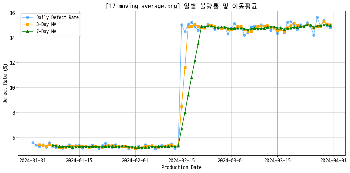
# 일별 불량률 이동평균
daily_defect = data_prd.groupby('production_date')['defect_rate'].mean()
ma_3 = daily_defect.rolling(window=3).mean()
ma_7 = daily_defect.rolling(window=7).mean()
figname = '17_moving_average.png'
plt.figure(figsize=(12, 6))
plt.plot(daily_defect.index, daily_defect.values, marker='o', label='Daily Defect Rate', alpha=0.5)
plt.plot(ma_3.index, ma_3.values, marker='s', label='3-Day MA', color='orange')
plt.plot(ma_7.index, ma_7.values, marker='^', label='7-Day MA', color='green')
plt.title(f'[{figname}] 일별 불량률 및 이동평균')
plt.xlabel('Production Date')
plt.ylabel('Defect Rate (%)')
plt.legend(loc='upper left')
plt.grid()
plt.tight_layout()
plt.savefig(img_save + figname)
plt.show()
실습 프로젝트 1 OEE 분석
데이터 구성
파일 설명 주요 컬럼 p1_equipment.csv설비 마스터 (13대) equipment_id, line, equipment_type, rated_capacity_per_hour p1_product.csv제품 마스터 (6종) product_code, standard_cycle_time_sec, target_defect_rate_pct p1_production_log.csv일별 생산 실적 (~3,100건) production_date, shift, actual_quantity, good_quantity, actual_operating_time_min p1_downtime_log.csv비가동/로스 기록 (~430건) downtime_type, duration_min, cause - 설비: 13건, 제품: 6건, 생산실적: 3120건, 비가동: 427건
1. 데이터 탐색 및 전처리
1-1. 4개 데이터프레임 기본 탐색
설비
1
2
equipment.info()
equipment.head(13)
제품
1
2
product.info()
product.head(6)
생산 기록
1
2
prod_log.info()
prod_log.head().T
prod_log 데이터는 양품 컬럼이 float로 나와서 추가 확인함 → 문제 없었음
1
2
3
# 양품 갯수가 float로 표기된 사례 확인 → 없었음
has_decimal = (prod_log['good_quantity'].notna()) & ((prod_log['good_quantity'] % 1) != 0)
prod_log[has_decimal]
1
2
3
# 양품 갯수 != (실제 생산량 - 불량 수) 인 사례 확인 → 없었음
is_calculated = (prod_log['good_quantity'].notna()) & ((prod_log['actual_quantity'] - prod_log['defect_quantity']) != prod_log['good_quantity'])
prod_log[is_calculated]
1
2
3
# na 갯수와 비율 확인 → 아래 표 이외에는 결측치 없음
temp = pd.concat([prod_log.isna().sum(), (prod_log.isna().mean() * 100).round(2)], axis=1, keys=['NA Count', 'NA Ratio (%)'])
temp.sort_values('NA Ratio (%)', ascending=False)
NA Count NA Ratio (%) setup_time_min 111 3.56 good_quantity 84 2.69 actual_operating_time_min 66 2.12 1 2
# na 사례 확인 prod_log.loc[prod_log.isna().any(axis=1)].head().T
고장 기록
1
2
downtime.info()
downtime.head().T
1
2
3
# na 갯수와 비율 확인
temp = pd.concat([downtime.isna().sum(), (downtime.isna().mean() * 100).round(2)], axis=1, keys=['NA Count', 'NA Ratio (%)'])
temp.sort_values('NA Ratio (%)', ascending=False)
NA Count NA Ratio (%) cause 15 3.51 duration_min 5 1.17 1 2
# na 사례 확인 downtime.loc[downtime.isna().any(axis=1)].head().T
결측 사례 head만 봤는데 소정지에서 원인 불명이 많이 보여서 따로 봄. 근데 별 상관 없더라
1
2
3
4
5
6
7
8
9
10
11
# 고장 타입이 '소정지'인 경우의 원인만 다시 확인, na 포함 카운트
downtime[downtime['downtime_type'] == '소정지']['cause'].value_counts(dropna=False)

cause
칩 막힘        22
냉각수 부족    18
공구 파손      17
센서 오감지    13
소재 걸림      10
NaN            4
Name: count, dtype: int64
1-2. 생산 실적 결측치 처리
통으로 해결함
1
2
3
4
5
6
7
8
9
10
11
12
13
14
# 비어있는 good_quantity  = actual_quantity - defect_quantity로 계산: 이미 값이 있는 곳은 수정하면 안됨
# prod_log.loc[prod_log['good_quantity'].isnull(), 'good_quantity'] = prod_log['actual_quantity'] - prod_log['defect_quantity']
prod_log.fillna({'good_quantity': prod_log['actual_quantity'] - prod_log['defect_quantity']}, inplace=True)

# 비어있는 setup_time_min은 해당 설비의 평균 셋업 시간으로 대체
# prod_log.loc[prod_log['setup_time_min'].isnull(), 'setup_time_min'] = prod_log.groupby('equipment_id')['setup_time_min'].transform('mean')
prod_log.fillna({'setup_time_min': prod_log.groupby('equipment_id')['setup_time_min'].transform('mean')}, inplace=True)

# 비어있는 actual_operating_time_min은 해당 설비의 평균으로 대체
# prod_log.loc[prod_log['actual_operating_time_min'].isnull(), 'actual_operating_time_min'] = prod_log.groupby('equipment_id')['actual_operating_time_min'].transform('mean')
prod_log.fillna({'actual_operating_time_min': prod_log.groupby('equipment_id')['actual_operating_time_min'].transform('mean')}, inplace=True)

# 처리 후 결과 확인
prod_log.isna().sum()
1
2
3
4
5
6
7
8
9
10
11
12
13
14
15
log_id                       0
production_date              0
shift                        0
equipment_id                 0
product_code                 0
planned_quantity             0
actual_quantity              0
good_quantity                0
defect_quantity              0
planned_time_min             0
actual_operating_time_min    0
setup_time_min               0
operator_id                  0
is_outlier                   0
dtype: int64
1-3. 이상치 탐지
없었음
1
2
3
4
5
6
7
8
9
10
11
12
# prod_log의 actual_quantity 컬럼에서 IQR 이상치 탐지해 따로 플래그(is_outlier 컬럼에 True) 추가
Q1 = prod_log['actual_quantity'].quantile(0.25)
Q3 = prod_log['actual_quantity'].quantile(0.75)

IQR = Q3 - Q1
lower_bound = Q1 - 1.5 * IQR
upper_bound = Q3 + 1.5 * IQR

prod_log['is_outlier'] = ~prod_log['actual_quantity'].between(lower_bound, upper_bound)

# 결과 확인
prod_log['is_outlier'].value_counts()
1
2
3
is_outlier
False    3120
Name: count, dtype: int64
저거 하다 말아서 여기까지밖에 답안이 없음